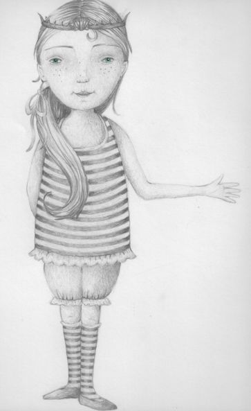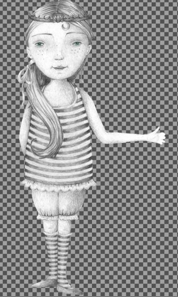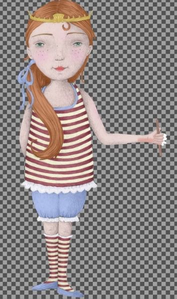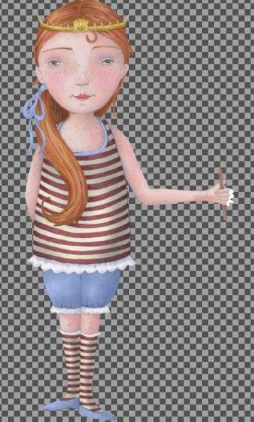
Here is my current process for creating the illustrations for my books.
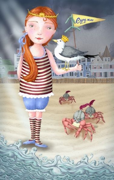
This painting example was created for the NJSCBWI 2014 Conference. I knew I wanted a dreamy, fairytale-ish feel. I wanted the viewer to wonder what would happen next. I also wanted to include the theme of the Jersey shore. First I researched elements I needed for this particular piece of work, ex. I needed to research old-fashioned bathing suit attire, seagulls, and Victorian style homes in Cape May.
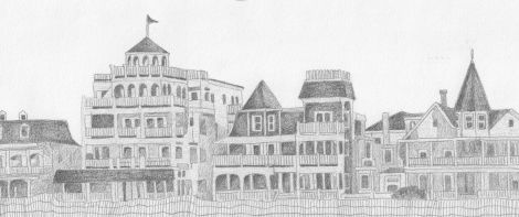
Next, I drew (in pencil) each element that was to be included in the artwork. I scanned in the early sketches and placed everything in the space to see if worked. I’d drawn a lifeguard chair and the Cape May lifeguard boat but they didn’t fit in the composition, so they were cut.
Then, I went back and shadowed each drawing in pencil. I scanned each shadowed piece into the computer and placed them on the page. All the shadowed pieces were built as their own layers.
I brought the colored drawings back into the original composition and adjusted scale and brightness.
I then layered in shadows into the final composition and sometimes I add various textures into the composition.
Finally, when the painting looks finished to me, I put a bump map of a watercolor texture over the entire painting. This makes the work look less “computer-like”.


